What Colour To Paint The Exterior Of Your House
Choosing what colour to paint the exterior of your house is undoubtedly one of the most important decisions when refreshing the look of your home.
Don’t worry – there are some helpful things to bear in mind to help you make the decision.
Before choosing a colour, ask yourself ‘what do I want to achieve?’ Do you want a modern aesthetic or a classic, neutral appearance? Maybe you want your house to stand out or do you want to achieve harmony?
This guide will walk you through how to choose the perfect exterior paint colour, from lighting to surroundings, so you can find the colour for your home.
 Key takeaways
-
- Natural light can completely change how exterior paint colours appear throughout the day.
- South-facing homes tend to make colours appear warmer and brighter.
- North-facing homes can make colours feel cooler and more muted.
How to Choose the Right Exterior Paint Colour
The colour of your home isn’t just purely about liking the colour on a screen or colour chart.
It can have a huge impact on how your house feels, how it looks in its environment and can even affect how large or small it appears.
Here are a few things to take into consideration before making a decision:
Natural Light & Direction
The direction of which your house faces plays a big role in how any exterior paint colour may appear.
- South-facing homes receive warm, golden light which can make colours appear brighter and slightly warmer than they may seem. Brighter shades like White, Off White and Witney Cream can look crisp, while slightly darker shades like Brown Sugar or Earth Stone may feel slightly softer.
- North-facing homes get more indirect, cooler light which can make colours seem slightly duller. Opting for a warm tone like Witney Cream, Magnolia or Pale Stone can help to prevent your house from feeling cold or washed out.
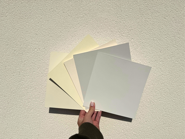
When it comes to the time to make your decision, always try real paint samples in different areas of your home’s exterior to see how it reacts to different light. Online colours are only used as an indication and can always vary depending on your screen.
We designed our hand-painted colour cards so you could see how each of our colours looks in situ. Simply compare each colour by holding them up to your exterior walls and test against each side of your house.
Consider Your Surroundings
For best results, try to consider your home’s environment when choosing a colour to create a truly cohesive look.
Urban & Modern Homes
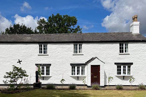
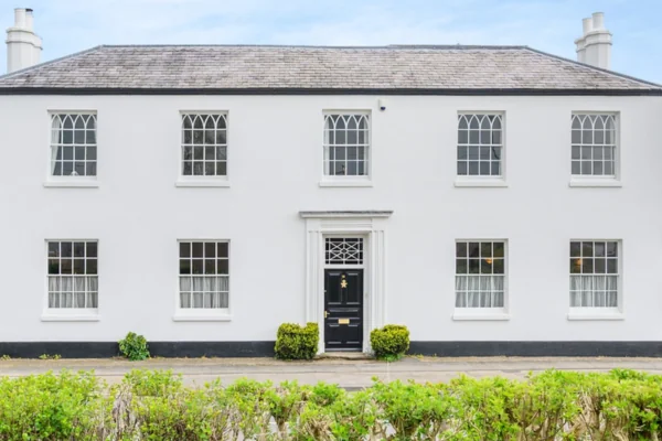
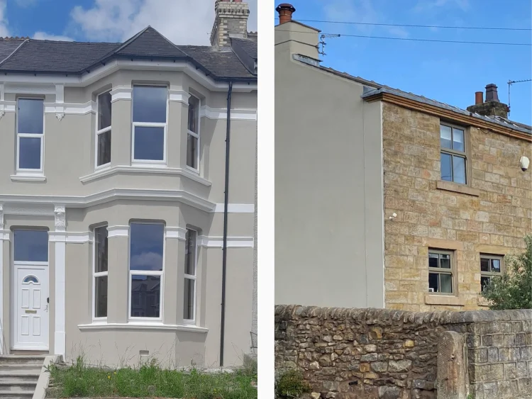
If your house is in a built-up area, shades like White, Light Grey or Smokey White create a sophisticated look that blends well with modern architecture.
These shades provide a modern feel due to their monochrome nature, providing varying levels of white and black hues. Without any discernable undertones, they provide have a neutrality that creates a flatter finish that feels sharp and clean.
It is also worth bearing in mind that without undertones, colours like this appear truer in changing light, while colours with undertones can vary at different times of day.
A standard white is a classic option for all types of houses, but when used with strong contrasting colours brings a sophistication and timelessness, while also being modern.
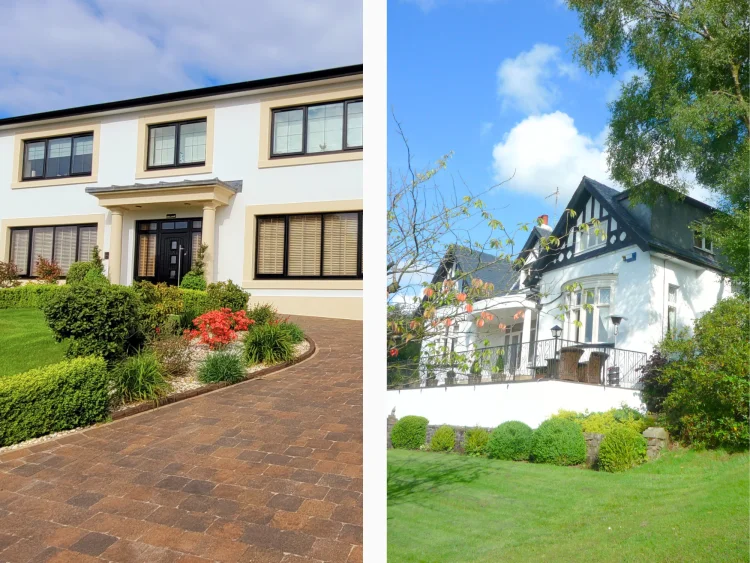
Courtesy of Andrew Barnett (left) and Gary (right).
While beautifully crisp, a standard white doesn’t provide the complexity and depth some homeowners look for.
A great alternative is ‘Smokey White’, an off-white with pure black undertones. This gives it all of the brightness of a white, but with less of the harshness in direct sunlight.
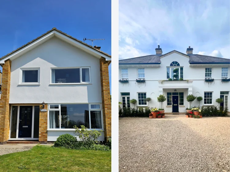
Courtesy of Marcus Margerison (left) and Matthew Valander-Blower (right).
With even more black pigment, ‘Light Grey’ is a very popular choice for homeowners looking for a modern finish.
Neutral while complex, it works particularly well with lighter accent colours. This gives a subtle contrast while still maintaining a light exterior.
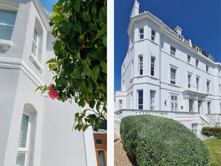
Courtesy of Harriet Bates (left) and S&G Painting & Decorating (right).
Rural & Countryside Homes
For houses with natural surroundings, earthy colours like Brown Sugar or Earth Stone help blend with your home’s backdrop.
‘Brown Sugar’, as the name would suggest, has a brown, earthy hue that is reminiscent of a caramel tone.
The beauty of Brown Sugar is that it mirrors the colours found by surrounding trees and plants, helping to create a cohesive look that helps your home work with its surroundings rather than against it.
Courtesy of @kelgarrod (left) and @deb_at_no27 (right).
‘Earth Stone’ has a deeper, stone-like shade that is suited for creating a gentle background for stronger accents or to mask areas and blend them into the surroundings.
Courtesy of Rob Williams (left) and Sarah Roundell (right).
Coastal Homes
Homes near to the seaside often look fantastic in light, pastel shades.
Bright and friendly colours like ‘Green Mist’ and ‘Witney Cream’ help reflect the freshness of their surroundings, while not overpowering the exterior of the property.
Green Mist is a pastel green that is soft enough to feel subtle but with just enough green to connect effortlessly to nature.
With more homeowners looking to add personality to their home, Green Mist and other pastels like it are fast becoming a crowd favourite.
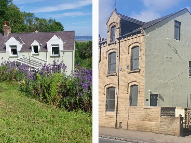
Courtesy of David Willis (left) and Paul Towlson (right).
Witney Cream is a classic cream shade with strong yellow undertones. The yellow hue brings a pastel feel, but with the classic tones that evoke a traditional, Tudor-esque finish.
To us, Witney Cream feels at home at the coast, capturing the shades of sandy beaches, Cornish ice cream and the warmth of a golden hour.
Courtesy of @lorkingjim (left) and TLC Decorating (right).
Combining colours
Your home doesn’t have to be one colour. The key to elevating your home’s exterior is to find the right colour combination for your home by utilising your home’s features.
There are a number of ways to approach contrasting colours. When using any colour, white trim will always provide a balanced look without ever clashing. Particularly when using light to mid tones such as Light Grey, Pale Stone, Pink Whisper, Green Mist or Chalky Grey.
If using white as a base for your colour scheme, you have a whole host of options available to you. One of our team of experts’ favourite ways to use white is as a base for a deeper, richer tone. ‘Beige’ works perfectly as a sandstone style shade, allowing you to create features of your plinths, sills and other decorative features.
Courtesy of Harriet Bates (left) and Andrew Barnett (right)
Another way to approach your home’s exterior trim is to use darker tones. Dark colours instantly create a more dramatic look, framing your home. This works particularly well with detached properties thanks to this ability to frame, providing the exterior with definition.
In the UK, Black and Anthracite Grey are the most popular colours to use for exterior trim thanks to their ability to work with almost any style of home and any colour.
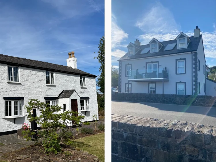
Courtesy of Harriet Bates (left) and Andrew Barnett (right)
Final Thoughts: Choosing What Colour to Paint Exterior of House
The perfect exterior house paint colour ultimately depends on your personal style, surroundings and the statement you want to make. After all, no one colour works for every house – your home should be an expression of you.
Whether you choose a timeless neutral, a modern grey, an earthy tone or a bold pastel, we always recommend testing the shades and consider how they look against your home and the lighting it receives.
Ready to start your transformation? Browse our full range of masonry paint colours and order your sample with free delivery.
Browse the gallery
Find your perfect colour