Exterior Paint Ideas For Terraced Houses
When starting your exterior decorating project, deciding on the right colour scheme can take some time in order to consider all of your options. After all, it is just as important as finding the right paint for the job.
To help inspire your project here’s our complete colour inspiration guide for terraced houses to help kickstart your project.
Things to consider
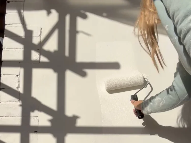
Painting the outside of your home isn’t something you want to have to re-do, so picking the right colour that you will love for years to come is so important. Here are some of the things our team of experts recommend thinking about before you start to pick up your paint brush.
1. THE STYLE OF YOUR TERRACED HOUSE
The first place to start is to consider the style of your home.
The architectural style of a terraced house plays a key role in determining the best colour scheme for you, with different eras having distinct features and materials. Victorian and Edwardian terraces, often with ornate detailing, work fantastically well with whites and other lighter tones.
One of the common worries with white exterior walls is their tendency to show dirt much easier than deeper tones. With our self-cleaning formulation, you don’t have to worry about that as your walls will keep their newly painted look.
Period properties can often truly shine when paired with a traditional colour, like an off-white or cream. Not too bright to overpower the architectural details, yet light enough to enhance any intricate features, these shades offer timeless elegance.
1900’s terraces with rendered walls are generally more versatile, allowing you to truly express your personality with the colours you opt for. We love this stunning mid-terrace house where Emily used ‘Rose Pink’ combined with ‘Light Grey’ trim to create this light and friendly appearance that will be sure to be the envy of the street.
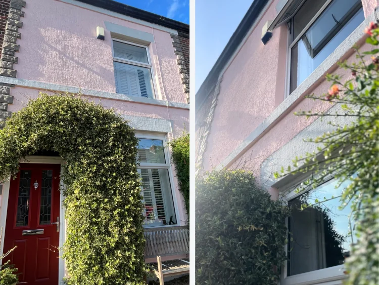
Emily Jackson using ‘Rose Pink’ and ‘Light Grey’
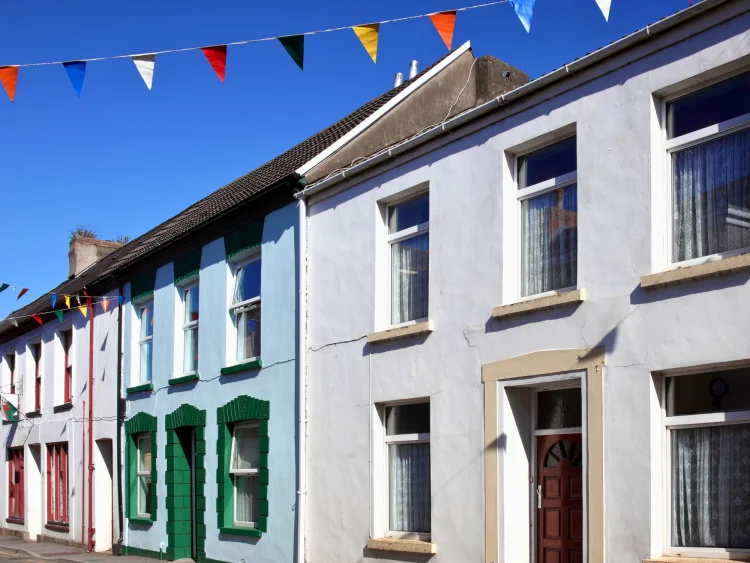
2. THE AREA
From coastal towns to urban streets, different settings come with unique environmental and stylistic factors that should be considered when selecting a paint colour.
This is particularly important for terraced houses where your adjoining neighbour’s houses can significantly impact how your own house appears.
You may want your terraced house to intentionally stand out from your row or in contrast you may want to harmonise with your neighbours.
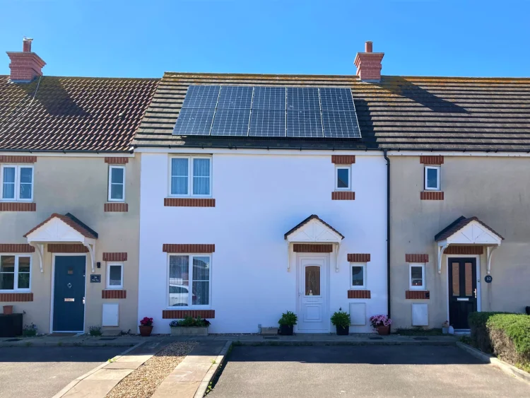
Shelley Dennis using ‘White’
3. THE LIGHTING
As with picking any exterior colour, the single most important thing to consider when picking a colour for your terraced house is lighting.
Natural light can drastically change how a colour appears, so taking time to see how much light your home receives is crucial. This is particularly important with terraced houses as you are looking for a colour that is going to work specifically for the front of your home.
- North-facing homes receive less sunlight, so lighter and warmer shades can help counteract this
- South-facing homes get lots of sunlight, making cooler and darker tones more accessible
Terraced houses in urban areas can often have shadows cast by neighbouring houses which change hour by hour, so checking how colours will look at different times of the day is a great way to ensure your picking a colour that works for your home all day long.
The period detailing and elegant proportions of some traditional terraced houses make them a perfect canvas for a classic white exterior, as perfectly demonstrated by Masahiro. In denser, urban areas, a white-painted exterior can help reflect natural light, making the house feel brighter and more spacious from the outside.
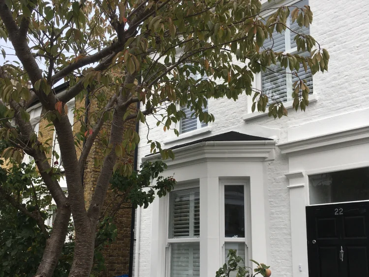
Masahiro Koh using ‘White’
4. MID VS END TERRACES
When choosing an exterior paint colour for your terraced house, the final thing to consider is whether it is a mid-terrace or an end-terrace. The position of a terraced house plays a crucial role in how a colour is perceived, influencing both its appearance and how it harmonises with the surrounding environment.
Not only will their exposure to light and position with neighbouring houses influence the best colour choices, but the addition of a gable end to the property can open up further options for end-terraces.
Naturally, end-terraces are more exposed to light: End-terrace houses typically have at least one exposed side, allowing for more natural light and giving greater flexibility to use richer, deeper colours.
In areas that don’t catch side light like Marcin’s home, colours can appear darker than expected, meaning a bright white can be a perfect choice.
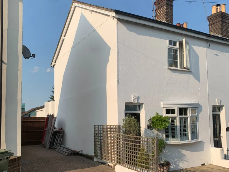
Marcin Wojcik using ‘Off-White’
The gable end of an end-terrace can present a fantastic opportunity to add depth and character through colour. A rendered wall can be transformed with a subtle contrast or a coordinating accent shade, helping to define the property’s shape and create a more considered aesthetic.
Sarah chose ‘Earth Stone’ to complement her stone masonry, achieving a seamless transition between the painted surface and the natural textures. Opting for a warm, earthy tone, she not only enhanced the heritage character of her property but also ensured it blended harmoniously with the original stonework. The result? A cohesive, intentional finish adding both personality and sophistication to their beautiful terraced house.
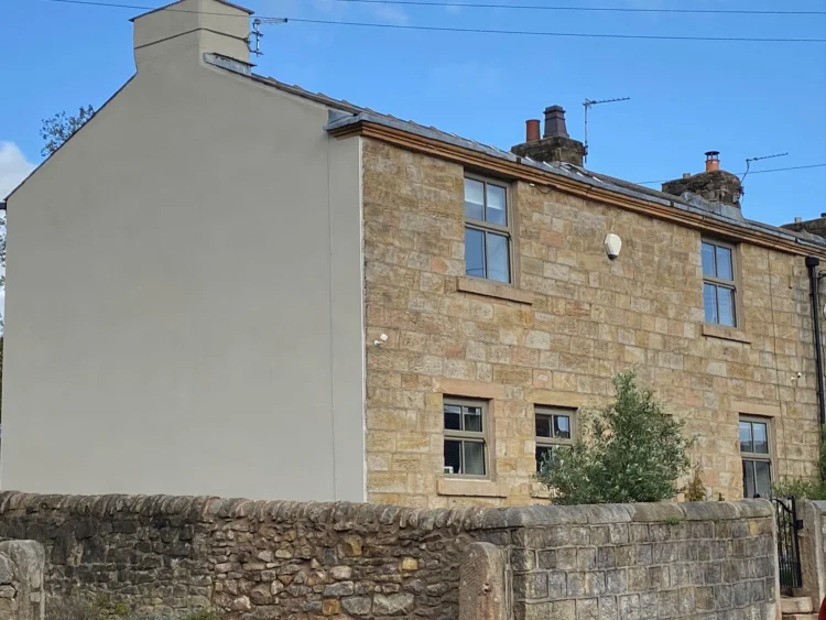
Sarah Roundell using ‘Earth Stone’
We hope this has helped inspire you ready to paint your terraced house. To get even more inspiration from across our community, browse our colour inspiration gallery. Ready to get started? Explore the full 18 colours in our standard colour range and order your sample with free delivery on all orders.